Webpage Screen Resolution Simulator
Enter a URL
Webpage Screen Resolution Simulator
Want to know how a site looks on a phone, tablet, or large monitor — without grabbing every device you own?
Enter a URL, pick a screen size, and preview the page in that resolution. It’s a quick way to spot layout problems before visitors do.
How to Use It
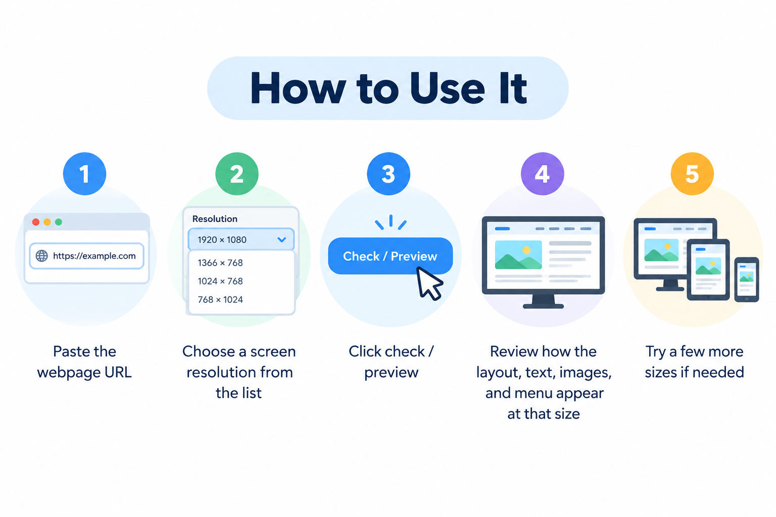
- Paste the webpage URL
- Choose a screen resolution from the list
- Click check / preview
- Review how the layout, text, images, and menu appear at that size
- Try a few more sizes if needed
No account required.
Why This Kind of Test Matters
People browse on very different screens. A design that looks fine on a wide desktop can break on a small phone — overlapping buttons, tiny text, horizontal scrolling, or menus that don’t open properly.
Because so much traffic is mobile, checking a few common sizes helps you catch issues early and keep the experience usable for more visitors.
Common Sizes Worth Testing
Mobile
- 320 × 480
- 375 × 667
- 414 × 896
Tablet
- 768 × 1024
- 800 × 1280
Desktop
- 1366 × 768
- 1920 × 1080
You don’t need every possible resolution. A small set covering phone, tablet, and desktop is usually enough for a practical check.
Problems This Tool Can Help You Spot
- Content overflowing the screen
- Images too large or stretched
- Text that’s hard to read
- Navigation that collapses badly
- Buttons that are too close or hard to tap
- Unwanted horizontal scrolling
- Sections that look fine on desktop but stack poorly on mobile
Fixing these improves usability and makes the site feel more polished.
Responsive Design in Plain Terms
A responsive site adapts its layout to the screen width. Columns may stack, menus may become a hamburger icon, and images may scale down.
This simulator doesn’t replace real-device testing or browser developer tools, but it’s useful for a fast visual check of how a page behaves at different widths.
Practical Tips
- Test your most important pages (homepage, product pages, contact, checkout)
- Check both portrait-style mobile sizes and wider desktop sizes
- After design or CSS changes, re-test key breakpoints
- Make tap targets large enough on small screens
- Avoid fixed widths that force horizontal scrolling
Google uses mobile-first indexing, so a broken mobile layout can affect both users and search performance.
Frequently Asked Questions
Is this tool free?
Yes. You can preview pages without signing up.
Is this the same as testing on a real phone?
Not exactly. It’s a useful simulation of screen size. Real devices can still differ slightly due to browsers, zoom, and OS behavior.
Can I test any website?
Most public pages work. Some sites block embedding or framing, which can limit the preview.
Does a good mobile layout help SEO?
Yes, indirectly. Better usability can improve engagement, and mobile-friendly pages align with how Google evaluates sites.
What should I do if the layout looks broken?
Adjust the responsive CSS, fix overlapping elements, and re-check the same resolution after changes.
Related Free Tools
- What Is My Browser
- Server Status Checker
- Get Source Code of Webpage
- Link Analyzer Tool
- Meta Tags Analyzer
Note
This tool previews a page at selected dimensions. For final QA, also test on real devices and in browser developer tools when accuracy is critical.