Webpage Screen Resolution Simulator
Entrez une URL
Simulateur de résolution d'écran de page Web
Vous voulez savoir à quoi ressemble un site sur un téléphone, une tablette ou un grand moniteur — sans avoir à ramasser tous les appareils que vous possédez ?
Entrez une URL, choisissez une taille d'écran et prévisualisez la page dans cette résolution. C'est un moyen rapide de repérer les problèmes de mise en page avant les visiteurs.
Comment l'utiliser
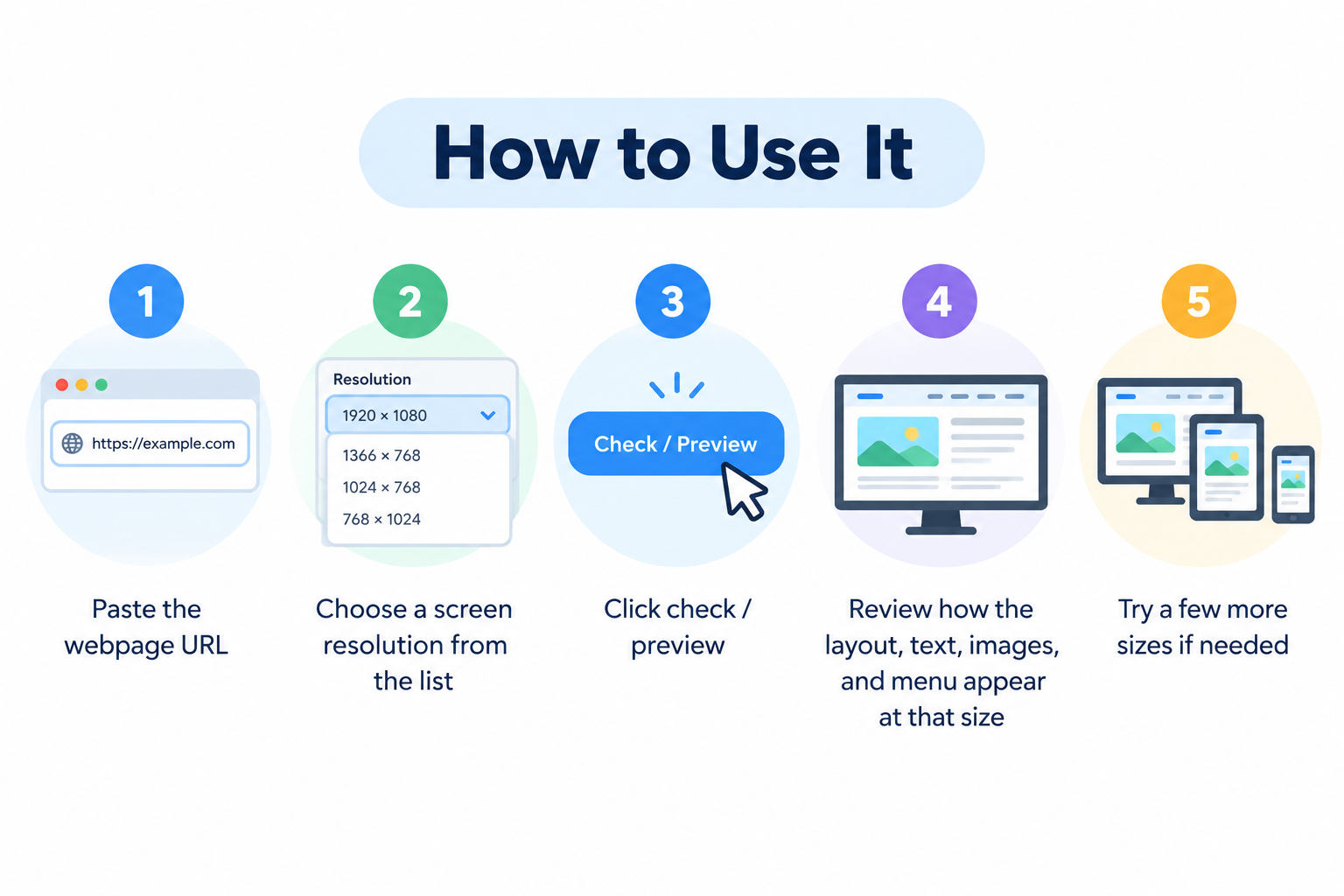
- Collez l'URL de la page Web
- Choisissez une résolution d'écran dans la liste
- Cliquez sur vérifier / aperçu
- Vérifiez l'affichage de la mise en page, du texte, des images et du menu à cette taille
- Essayez quelques tailles supplémentaires si nécessaire
Aucun compte requis.
Pourquoi ce type de test est important
Les internautes naviguent sur des écrans très différents. Un design qui s'affiche correctement sur un grand bureau peut se casser sur un petit téléphone — boutons qui se chevauchent, texte minuscule, défilement horizontal ou menus qui ne s'ouvrent pas correctement.
Étant donné qu'une grande partie du trafic provient des mobiles, vérifier quelques tailles courantes vous aide à détecter les problèmes en amont et à maintenir une expérience utilisable pour un plus grand nombre de visiteurs.
Tailles courantes à tester
Mobile
- 320 × 480
- 375 × 667
- 414 × 896
Tablette
- 768 × 1024
- 800 × 1280
Bureau
- 1366 × 768
- 1920 × 1080
Vous n'avez pas besoin de toutes les résolutions possibles. Un petit ensemble couvrant le téléphone, la tablette et le bureau suffit généralement pour un contrôle pratique.
Problèmes que cet outil peut vous aider à repérer
- Contenu dépassant de l'écran
- Images trop grandes ou étirées
- Texte difficile à lire
- Navigation qui s'effondre mal
- Boutons trop proches ou difficiles à toucher
- Défilement horizontal indésirable
- Sections qui s'affichent correctement sur bureau mais s'empilent mal sur mobile
Corriger ces éléments améliore l'ergonomie et donne au site un aspect plus soigné.
Le design responsive en termes simples
Un site responsive adapte sa mise en page à la largeur de l'écran. Les colonnes peuvent s'empiler, les menus peuvent devenir une icône hamburger et les images peuvent être réduites.
Ce simulateur ne remplace pas les tests sur de vrais appareils ou les outils de développement des navigateurs, mais il est utile pour une vérification visuelle rapide du comportement d'une page à différentes largeurs.
Conseils pratiques
- Testez vos pages les plus importantes (page d'accueil, pages produits, contact, paiement)
- Vérifiez à la fois les tailles mobiles en mode portrait et les tailles de bureau plus larges
- Après des modifications de design ou de CSS, testez à nouveau les points de rupture clés
- Rendez les zones cliquables suffisamment grandes sur les petits écrans
- Évitez les largeurs fixes qui forcent le défilement horizontal
Google utilise l'indexation mobile-first, de sorte qu'une mise en page mobile défectueuse peut nuire à la fois aux utilisateurs et aux performances de recherche.
Foire aux questions
Cet outil est-il gratuit ?
Oui. Vous pouvez prévisualiser des pages sans vous inscrire.
Est-ce la même chose que de tester sur un vrai téléphone ?
Pas exactement. C'est une simulation utile de la taille d'écran. Les vrais appareils peuvent encore différer légèrement en raison des navigateurs, du zoom et du comportement du système d'exploitation.
Puis-je tester n'importe quel site Web ?
La plupart des pages publiques fonctionnent. Certains sites bloquent l'intégration ou le encadrement (framing), ce qui peut limiter l'aperçu.
Une bonne mise en page mobile aide-t-elle le SEO ?
Oui, indirectement. Une meilleure convivialité peut améliorer l'engagement, et les pages adaptées aux mobiles correspondent à la manière dont Google évalue les sites.
Que dois-je faire si la mise en page semble cassée ?
Ajustez le CSS responsive, corrigez les éléments qui se chevauchent et revérifiez la même résolution après les modifications.
Outils gratuits associés
- What Is My Browser
- Server Status Checker
- Get Source Code of Webpage
- Link Analyzer Tool
- Meta Tags Analyzer
Remarque
Cet outil prévisualise une page selon des dimensions sélectionnées. Pour le contrôle qualité final, testez également sur de vrais appareils et dans les outils de développement du navigateur lorsque la précision est critique.